Project Overview
Procter and Gamble (P&G) is a multinational consumer goods company that sells its products, in part, on Amazon. However, P&G beauty product closure on Amazon has been lower than expected. User experience (UX) issues may be to blame. Past UX studies indicated obstacles that Amazon shoppers face. These include scrolling fatigue, cognitive overload, and an overwhelming experience navigating purchase decision factors, which were connected to the low closure rates.
In order to promote the purchase of P&G beauty on Amazon, this project aims to improve the presence and discovery of P&G products, both in terms of optimizing user awareness and ensuring ease of location.
Process
-
User Research
-
Design Workshops
-
Sketching
-
Interviewing
-
User Testing
-
Usability Testing
-
Wireframing
-
Competitive Analysis
Team
-
Natalie Newton
-
Rashi Kanungo
-
Gianna Maihofer
-
Avery Kruppe
-
Seoyeon Lim
-
Avery Dellinger III
-
Caitlyn Hagen
-
Chanseo Shin
-
Hannah Ahn
Timeline
January 2024 - May 2024
Skincare Team
Created designs and solutions for skincare discovery on Amazon
Created Mock-ups in Figma
Used Figma to create iterative designs (lo-fis, mid-fis, and hi-fis) for our final solution
Led Meetings with Stakeholders
Communicated with sponsors over zoom to showcase ideas/ methods for feedback and open discussions
Conducted & Created Usability Tests
Formulated interview protocols and utilized them during interviews with participants
My Contributions
Online Shopping Experience
We completed a variety of activities in order to understand our problem space and the needs of our user group, such as by conducting secondary research, interviews with our users, and competitive analyses of existing online stores.
Through our activities we gained valuable insight we could use in our design going forward such as:
-
Visual Merchandising Methods
-
Sales Terminology
-
What Factors Affect Consumer Purchasing Decisions
-
Different Shoppers
-
Comparing Online Versus In-Store Shopping
Secondary Research
We began our secondary research as our first step. We began debating the pros and cons to both online shopping and in-store shopping, researched visual merchandising methods, learned sales terminology that was prevalent in our kickoff meeting with our sponsors, researched consumer purchasing decisions, and identified different groups of online shoppers.
Takeaways:
Through research via online journals and articles, we were able to gain a better understanding of:
Visual Merchandising Methods
-
We could incorporate methods such as using color and visual hierarchy, which is used in store, to catch the eyes of consumers virtually.
Sales Terminology
-
By increasing our understanding of sales terminology including trade up, closure rate, and household penetration, we can better understand the goals of our sponsors.
What Factors Affect Consumer Purchasing Decisions
-
Price is the main factor for a customer purchasing an item at 41.1%.
-
82% of consumers read product reviews before making shopping choices.
-
49% of Amazon customers examine pricing on other websites before making a purchase.
-
Prior experience with the product/brand increases the purchasing decision of users by 9.1%
Different Shoppers
-
Types of shoppers include convenience shoppers, variety seekers (explorers), replenishers, balanced buyers, and store-oriented.
-
Each type has their own distinct criteria ranging from comprehensive product information to more discovery avenues.
Comparing Online Versus In-Store Shopping
-
We found that online shopping provided strengths over in-store shopping including convenience, increased product comparison abilities, access to reviews, and exclusive discount offers.
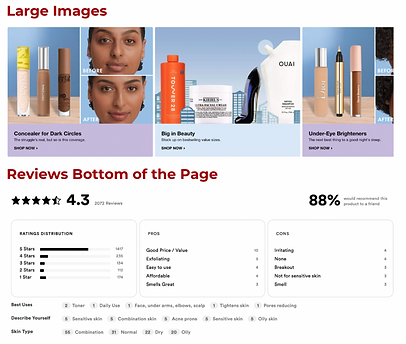
Competitive Analysis: Digital Storefronts
The goal for this activity was to assess Amazon’s mobile platform in comparison to competitor storefronts, aiming to identify their strengths and weaknesses while looking for potential opportunities for improvement. Our focus centered on evaluating how page layout and the information presented add pain points or aid the online beauty shopping experience.
Key Takeaways:
Common Strengths:
-
Detailed information on beauty product pages, including details on ingredients, uses, and reviews
-
Many categories and filters to enhance users’ refinement of beauty product searches
-
Various strategies were employed to encourage users to make additional purchases, including categories such as “Customers Also Bought”, “Similar Items,” “Featured,” and “Trending.”
-
Interactive quizzes aiding users in discovering suitable products

Common Weaknesses:
-
Excessive text content
-
Scrolling fatigue
-
Placement of reviews at the bottom of the page
-
Overuse of large images that dominate the screen, disrupting the flow of the product page.
Initial Interviews

We conducted 11 interviews with members of our target user group, aged 20-30 who intend to purchase beauty products on Amazon. We developed an interview protocol with questions in five topic areas:
-
Purchasing Decision Factors
-
Buying Habits & Product Discovery
-
Product Verification & Purchase
-
How Amazon Mobile Supports the Purchase of Beauty Products
-
Comparison with Other Platforms
Affinity diagram of our interview findings in categories of research/criteria, competitors, positive remarks, pain points, and opportunities
Ideation
After synthesizing our interview results, we began to ideate

Basic ideas for final design oppurtunities

We also sketched screens to explore design concepts. Above are the sketches I created.
Wireframing
Our team created wireframes in Figma to visualize the layout and flow of our redesign.

Lo-Fi iteration of our final design
Usability Testing
After elevating our wireframes to mid-fi designs, we conducted user testing with with participants who have experience using skincare products. We gained valuable insights and continued making iterations based on the feedback we received.

Mif-Fi iteration of our final design used for usability testing
Feedback from users...
Positives:
-
Overall design was considered intuitive and easy to navigate.
-
Users appreciated the “Add All to Cart” functionality for faster checkout.
Negatives:
-
Users bypassed skincare quiz
-
Certain comparison features deemed unnecessary for users (e.g., “weight”, and “deal price”).
-
“Tap to choose/compare products” button was often unnoticed
-
Wanted the compare button on both products tab and regimen tab
-
Some users saw skincare quiz banners between products in the search results as an ad.
-
“Why?” section in the quiz results products tab not noticed/ignored by users.
Design Changes
After conducting usability testing we gathered the feedback and reflected on how we could make essential changes to our prototype. These changes included:
Product Discovery page
-
Skincare search: Instead of having the “Skin Care Quiz” button placed multiple times throughout this page, causing users to scroll past through it, we changed it to a static floating button on top of the page so that it’s easily noticeable.
Skincare Quiz Results
-
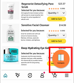
Products page: We added a Compare Widget on the products page to improve the visibility and discoverability of the compare feature allowing the users who might not click on the “Regimen” tab, to compare products from this page itself. We also changed the wording of why a particular product was selected for the user after taking the quiz from “why?” to “Selected for you because:” to make it more understandable and meaningful as suggested by our users.
-
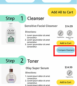
Regimen Page: We changed the placement of the “Compare button” from left-hand side (below the images) to right-hand side (below “Add to Cart” button) so that it is easy to find.
Compare Page
-
We removed the“weight of the product” category from the compare feature as we received feedback from our users that it might be unnecessary. Additionally, having two different price tags “List Price and Deal Price” was changed to just one tag “Price” as having two different tags can be confusing for the users.


Final Design (Skincare)
Our goal of this prototype is to help users who are searching for new products to discover the value that Olay can bring to them through their products and skincare quiz. We wanted to make our designs intuitive while also matching the Amazon mobile app’s current style and incorporating some of Olay’s branding.

If searching a generic term, users can browse different brand's skincare quizzes.
If searching a specific brand users can take the dedicated skincare brand quiz

After taking a quiz, the user would be prompted to their recommended products of different types.
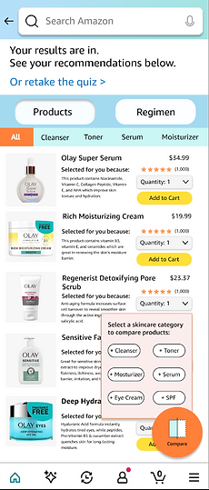
The widget allows users can compare different products.

They also would be able to view the step-by-step process of their routine by clicking the regimen tab.
*Scrollable screen

Reflection
If I had more time with this project, I would continue to user test, iterate, and polish the final design. I learned more about Figma and its features during this project such as utilizing components, maintaining a consistent design system, and creating variants. Working with a team under time constraints heightened my skills of collaboration and time management as well.